Digital productsBeginner · About 40 minutes
Printable wall art: from idea to print-ready files
Plan a small collection, generate original artwork, set up the right pixel sizes and prepare files customers can print.

MusicBeginnerAbout 30 minutes
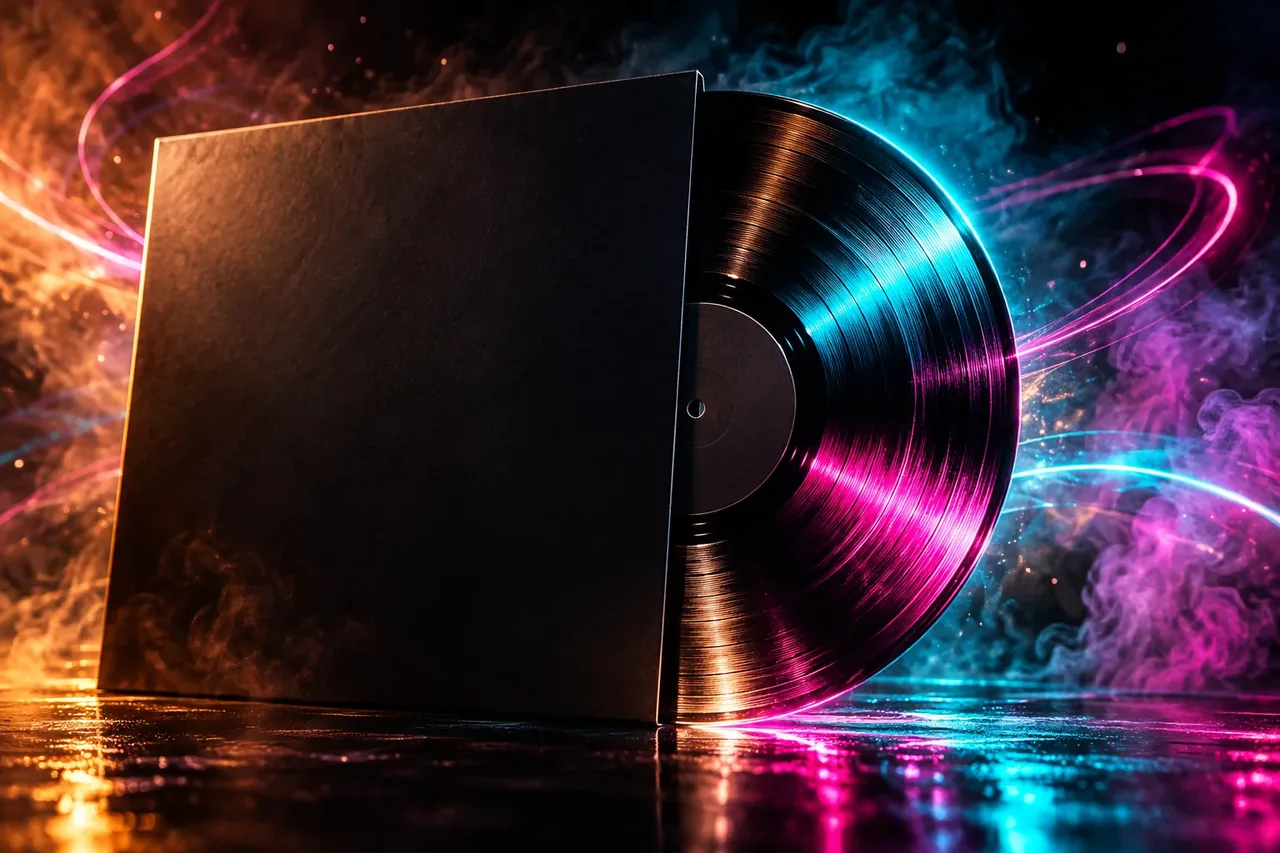
Develop a visual direction, generate square variations, set the type yourself and test legibility at the sizes listeners actually see.
One square cover that works as a large image and as a tiny thumbnail, exported to the size your distributor asks for.
Best for: Independent artists and label owners who need a distinctive cover without commissioning custom artwork for every release.
Describe the track in three adjectives and one physical scene (“cold, nocturnal, tender; an empty car park after rain”). The scene gives the image model something concrete, and the adjectives keep the palette honest.
Use photography, film stills you have rights to, textures and colour swatches. Copying another release’s layout makes your cover look like a worse version of it and can cause rights problems.
Ask for 1:1 images with a clear focal point and empty space where text can sit. Generate in batches, and shortlist three. Reject images with distorted faces, extra fingers, or fake lettering.
Tip. Generate without any text in the prompt. Models do not spell reliably, and your title should be set in a real typeface.
Add the artist name and title yourself. Keep the type to one or two lines and use a weight that stays readable when small. Place it where the image is calm so contrast is high.
Shrink the cover to 64 × 64 pixels and look at it from arm’s length. If you cannot tell what it is or read the name, simplify: fewer elements, higher contrast, larger type. Then check it in grayscale.
Most distributors ask for a square image in the region of 3000 × 3000 pixels, RGB colour, JPEG or PNG. Some reject artwork with URLs, prices, social handles or other brands’ logos. Use the numbers in your distributor’s guide, not ours.
If you release often, fix a template: the same type position, the same grid, a different image. Fans recognise a series in a feed before they read the name.
Replace anything in [square brackets]. Prompts are starting points: results vary between tools and versions, so review every output.
Prompts are written in English because image, video and most text models follow English instructions best. To get answers in your language, add “Reply in English.” to a prompt for a text assistant.
Use this with a text model to turn a track into a visual brief.
The track is [genre] and feels [three adjectives]. Suggest 5 single-image cover concepts. For each give a concrete scene, a colour palette of 3 colours, a focal point, and where empty space for text would go. Avoid clichés for this genre and do not reference any existing album cover.Use this for each shortlisted concept.
[Scene]. Square 1:1 composition, single clear focal point in the [upper left / centre / lower third], large calm area for text on the [side], [palette], cinematic lighting, fine film grain, no text, no letters, no logos, no watermark.Paste a description or screenshot summary of your cover.
Here is my cover: [describe layout, colours and type]. It will be seen at 64, 128 and 640 pixels. Tell me what will be lost at each size and give 3 specific changes that improve legibility without changing the mood.Tick items as you go. Nothing is saved or sent.
0 of 6 checked
Digital productsBeginner · About 40 minutes
Plan a small collection, generate original artwork, set up the right pixel sizes and prepare files customers can print.
VideoIntermediate · About 60 minutes
Write a five-shot plan, create stills first, animate short clips from them and cut the result in a normal editor.